In today's era, 80% of web traffic comes from mobile devices. However, many companies still design their sites thinking first of the desktop, and then "adapting" everything to the mobile as if it were a secondary step. That is the number one error that destroys conversions before the user reads a single line.
1. Loading speed: the critical factor
Google actively penalizes slow sites. A landing page that takes more than 3 seconds to load over a 4G network loses 50% of its visitors before they even reach the first headline. It's not a minor statistic: it's half of your advertising investment evaporating on the loading screen.
To solve it, these three actions have the greatest immediate impact:
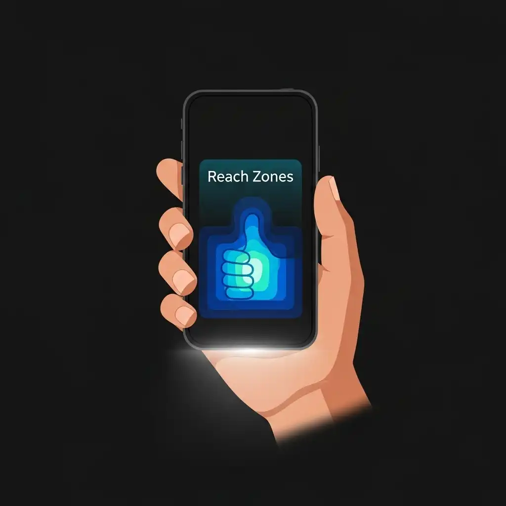
2. Thumb-based design
Ergonomics rule. Most people use their mobile with one hand, and the thumb has a natural range of movement that covers the bottom and middle part of the screen. Interactive elements —WhatsApp buttons, menus, forms— that remain in the upper zone are uncomfortable to reach, and discomfort kills action.
The rule of thumb: your main CTAs go in the lower or middle zone of the screen. Not in the header. Not floating at the top. Where the thumb reaches without effort.
Conclusion
Optimizing for mobile is not an aesthetic decision. It is a direct commercial necessity: a customer who reaches your website from their mobile and finds it slow or difficult to use, simply leaves. They don't protest, they don't write to you. They just bounce.
A fast, readable, and comfortable-to-use landing page from your customer's pocket is not a technical luxury. It is the difference between a sale and a bounce.
Does your business have a mobile-first website? At Vortex Studios, we design landing pages optimized for mobile from the first pixel — not desktop adaptations. If you want to know how your business would look with a website that actually converts, check out our work by accessing the top of the page at VORTEX STUDIOS.